Design a musician booking app for wedding day in your favorite city
If you are looking for a musician to play at your wedding, you might feel overwhelmed by the options and the hassle. That's why Weddly is here to help you.
Weddly is a social platform that brings together customers and musicians who offer their services for weddings. You can post an inquiry, browse, compare and contact different musicians on Weddly, and find the one that suits your style and budget. With Weddly, you can easily book the perfect musician for your special day."
I assumed the following roles designing this app:
• User Experience (UX) Designer
• User Interface (UI) Designer
Interaction Design: High-fidelity interactive prototypes for key tasks on mobile first.
UX/UI Design:
• Competitive analysis
• User one-on-one interviews
• Personas
• User journeys
• Site map
• Low-fidelity wireframes
• High-fidelity mockups and prototypes
• Design system
Duration: 6 months
Tools:
• Figma
• Photoshop
• Illustrator
• Procreate
The aim of this project, conducted in Chiangmai city, was to achieve the goal set by Sharpen. We'll investigate the challenges faced by customers who are looking for the right musician for their wedding. They have to consider factors such as budget, preferences, theme, and availability, as well as communicate the details with the musician.
By the way, Weddly is not just a booking service for wedding musicians, but also a social platform where you can connect with other musicians and find your ideal match. You have many options to find musicians: you can post an inquiry on the home feed and see who responds, or you can search and choose the one that suits your preferences. As a musician, you can showcase your talent, reach out to many clients, and benefit from standard contracts on this social platform.
Planning a wedding in Chiangmai city can be stressful, especially when it comes to finding the right musician. The issues can result in frustration, disappointment, and wasted time for the couples who want to make their wedding day memorable and enjoyable. That's why they need a better solution for booking musician for their wedding.
Some of the common problems that bridges & grooms face as following below.
• Spend a lot of time for make a deal and time consuming.
• Implement a streamlined and efficient booking process that allows users to post inquiry for communicate with musicians, negotiate terms, and finalize deals quickly.
• No idea where to find musician for wedding.
• Create a user-friendly search feature that enables users to easily browse and discover local musicians based on genres, instruments, and reviews.
• Musician not available in wedding day.
• Integrate a real-time inquiry post for reduce argument between user and musician.
• The musicians are unprofessional and lack credibility.
• Implement a secure booking system with contracts and agreements. Also implement review system. Allow users to rate and review musicians based on their professionalism, performance, and reliability.
• Rely on wedding studio.
• Encourage direct communication between users and musicians through the app.
• Concern about budget.
• Provide a budget filter within the app. Musicians can list their pricing, and users can set budget preferences to find options that align with their financial plans. Use the comparison feature to find the musician that best fits user budget.
• Always ask the same question with customer etc. indoor or outdoor.
• Implement a streamlined and efficient booking process that allows users to post inquiry for communicate with musicians, negotiate terms, and finalize deals quickly.
• Set schedule as manual.
• Introduce a schedule feature and link to calendar also link to email with notification alert
• Gray area about payment.
• Implement payment system that fair for user and musician included summary section where user and musicians can review.
• Don’t know how to make contract.
• Include a contract template feature within the app. When a booking is confirmed with essential details such as date, time, venue, and payment terms.
• Sometime customers ask and disappear.
• Provide post feature that could be met the potential user.
This is the first step for the project to discover new possibilities and generate ideas. I chose user interviews as a methodology because they are suitable for the initial discovery phase. User interviews can help me gain qualitative data such as general patterns and themes related to people's experiences, problems, behaviors, and opinions.
Following steps of the research process as below,
Before we dig into the details, the attached file as below is overall of define research goals and questions.
Or you can also "skip" to the interviews results as button below.
The first step of empathizing with the user is to determine the research goals. In this case study, I aim to identify the behaviors and experiences of booking a musician for a wedding day.
The following objectives are considered:
1. Understand what factors are most important to users when they choose a musician for their wedding.
2. Find out where users usually look for information when searching for wedding musicians.
3. Visualize the typical steps users take from initially searching for a wedding musician to completing the booking process.
4. Identify common issues and frustrations users face when trying to book a wedding musician.
I would categorize the participants to interview into 2 groups: customers (or users) and musicians.
Customer:
1. The population of Chiang Mai.
2. The number of married people around 5-10 persons.
3. The number of unmarried people who plan to marry someone around 5-10 persons.
4. Age range of the population, from 22 to 50 years old.
5. Any gender.
Musician:
1. A musician based in Chiang Mai.
2. Experienced in playing music for weddings.
3. The number of musicians for interview around 5-10 persons.
I chose the 5W1H method (What, When, Where, Who, Why and How) to generate questions because I had a limited number of interviewees, and I would like to gather detailed information and better understand the user perspective, challenges, expectations as many details as possible.
The questions have two parts: the first part is a general question to obtain personal details, and the second part is a series of 5W1H questions.
Please see all questions as attached file.
The following results are based on interviews with four users and two musicians. To achieve statistical significance, a larger sample size is required. An affinity diagram was used to prioritize the user problems.
1. 50% of users are no idea where to find musician for wedding.
2. 50% of users spend a lot of time for make a deal.
3. 50% of users concern if musician don’t show up.
4. 50% of users concern about budget.
5. 25% of user found some musicians aren't available in wedding day.
6. 25% of users are rely on wedding studio.
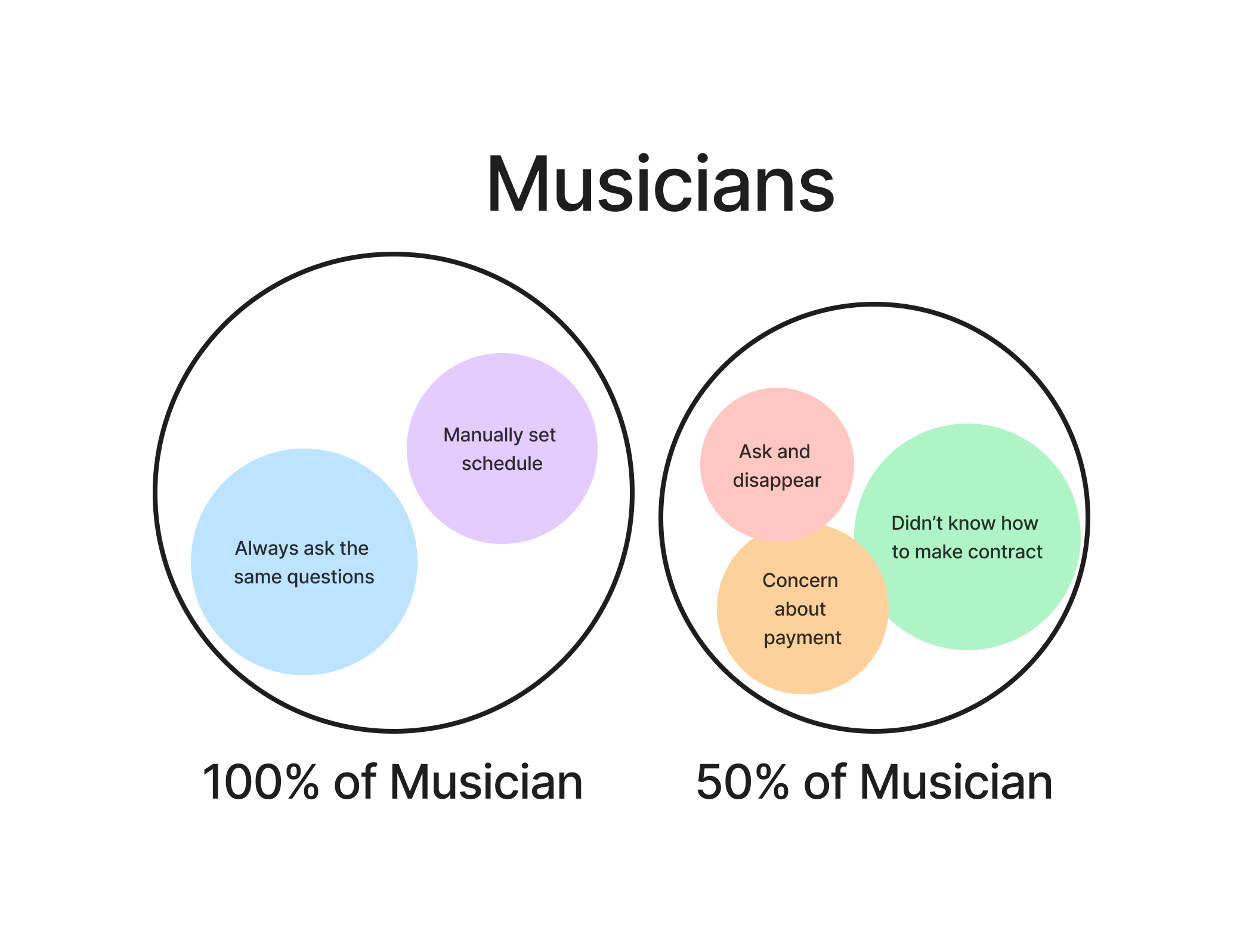
1. 100% of musicians always ask the customer about indoor/outdoor or same questions.
2. 100% of musicians manually set schedule.
3. 50% of musicians found sometime customers ask and disappear.
4. 50% of musicians don’t know how to make contract.
5. 50% of musicians concern about payment.
After conducting interviews, I identified two main user personas and one musician persona that capture the most important features and goals of the app. These personas represent goals of the target audience, as well as the painpoints and frustrations they face. By focusing on these personas, I was able to design a user interface and a user experience that reflect to their specific contexts and preferences.
To explore the perspectives of two personas (a user and a musician) who would interact with Weddly, I created journey maps for empathize users. I identified the key moments where they experienced emotions or followed a process.
For example, a user might feel anxious and frustrated when searching for a musician, because of the many choices, queries and availability issues. A musician might also have to deal with repetitive questions and contract details from different customers.
To gain more insight into the problem, we should examine the competitors and their target customers in the market. This will enable us to find the "opportunity" that will inform our product development.
The following is the opportunity lists:
1. Uniting Artists on a Social Platform:
The competitive audit report shows that the musician base in Chiang Mai is very low for LENSOD and MYBAND, with only 13 and 16 bands respectively. However, there is a large potential market in the Facebook group, which has 32,800 members. Assuming that 1% of them are musicians, that would be 328 bands, which is 1,031.03% more than LENSOD and MYBAND combined.
2. Mobile App for Convenience:
Developing a mobile app for easy notifications.
3. Job Queue Notification System:
Implementing a system for notifying musicians about job queues promptly.
4. Musician Profiles:
Allowing musicians to create their own profiles.
5. Clear Job Agreements:
Establishing clear agreements and contracts for job engagements.
6. Wedding-Related Articles:
Providing articles related to wedding events.
7. Event Calendar for Musicians:
Incorporating a calendar feature for musicians to check their job schedules.
8. Encouraging Reviews:
Creating incentives to motivate customers to use the platform and leave reviews.
(The photo is very small, so please save it and zoom in.)
To create a valuable product, I need to define the value proposition that addresses the pain points of our user persona and user journey. A competitive audit can help me find an opportunity to do so. This will ensure that I follow a design thinking and user-centered approach.
The attached file contains a list of features that I have categorized to create a value proposition.
This information architecture, based on research (user pain points, competitive analysis, etc.), shows the main task that the high-fidelity prototype would address:
1. Identify the user as a customer or a musician by selecting an option.
2. Create an inquiry to request an offer.
3. View and edit customer and musician profiles.
4. Search for musicians in a standard way.
5. Receive notifications.
By sketching quickly, I could examine the design patterns that many apps in the same market used, and decide which ones were essential for Weddly. This also helped me find out how to make some screens serve more than one purpose, and what kind of swiping or touching gestures would be the easiest to use.
Testing low-fidelity prototypes helped me learn how users wanted to complete the tasks I focused on. I observed their touch and swipe gestures. More importantly, I talked to them about their expectations and feedback. This way, I identified the adjustments I had to make for a more realistic high-fidelity prototype. No small details feedback just can't wait to see high-fidelity prototype.
According to a reference from the top wedding venue in Thailand 2023, most of the wedding venues have a romantic and elegant but minimal style, with a rustic touch that is not too outdated. The color scheme is mainly based on limestone slate, a green shade that reflects the natural setting of the outdoor wedding venue and creates a soothing and stable ambiance. The secondary color is sandy shore, a brown shade that adds a natural and cozy touch to the atmosphere, without being too stiff or formal.
The high-fidelity prototype showcases the main features and functionality of "Weddly", a platform that connects customers and musicians.
The prototype demonstrates five main flows that illustrate how the users can:
1. Log in and sign up with selected options to create a profile.
2. Post an inquiry with a form.
3. Apply for an offer that they see on the feed.
4. Receive an offer from a musician and complete the booking process.
5. Search for musicians and apply filters.
The visual design work based on a previous mood board. The main colors are light green and white, which create a feeling of elegance, cleanliness, and eye comfort. The icons are also made from the keywords to give a friendly and approachable impression, avoiding too bold or sharp elements.
This design style is based on the fact that most of the users, especially the ones who make decisions about weddings, are women. The whole design is focused on the user or customer, not necessarily following the style of musicians.
Finding musicians for weddings can be a tough task. Different people have different opinions, and no one knows where to start. Even online search-engine are not very helpful.
Designing this app emphasizes both customers and musicians. This is essential to confirm real needs and problems. I aim to solve the communication issues with inquiry forms and the lack of customers with a social platform. Also, this project base on no time limits, budget, shareholders or companies' requitement.
The social platform format is not new, but it is effective. However, it also poses a high risk of managing large amounts of data, collecting user data, and implementing algorithms on the feed. These challenges require constant learning from the designers.
Designed and prototyped mockups that show the idea of an app booking musician for wedding day in your favorite city. The app works on both mobile and desktop devices with responsive design.
Weddly app that provides innovative and effective solutions for the needs and problems of both customers and musicians. Unlike competitor websites, this is an investment in creative ideas and opportunities in this business.
1. Conduct usability testing with real users to gather feedback on the design.
2. Scale up, this project focuses on the population in Chiangmai. We must conduct surveys and interviews with a larger sample size to determine the overall user needs and the features that our design still solve their problems.
3. Engage users and communicate what we offer to attract them to use our services.
4. Musicians also need to post inquiry for recruiting band members. This requirement and feature need to be polished as well.
5. Opportunity in business, the advertising feature within the app is designed for musicians to pay for promoting their profile, or wedding studio to pay for promoting their service.
6. To help users who lack inspiration for their wedding, create an official profile in the app and use it to post wedding-related content.
7. Step into something bigger, not limited to just weddings. Explore all kinds of events, including festival celebrations, restaurant gatherings, company parties, solo artists for private dinners, or any occasion that requires musical entertainment.
1. The question of whether the event is indoors or outdoors stems largely from emphasizing the user through interviews. Therefore, if interviews with a larger sample group are conducted, it may provide additional insights, to a greater or lesser extent.
2. Starting a conversation to ask for information is one of the first things both users and musicians have to deal with. So, if we can make this step easier and show good results, it confirms that the app can serve users well.
3. If users prefer to search on their own and if the conversation between users and musicians becomes too long, it reduces the chances of successfully booking.
From current research gathered by Kasikorn Research Center about food delivery in 2023, it is found that food delivery platforms need to improve the quality of service to maintain the user base of Generation X and Y. This is due to changing behaviors, such as choosing to dine out, buying food to take home, or cooking more at home. It aims to address and minimize issues related to the increasing cost of adjusting to a higher standard of living, receiving food that does not meet expectations, inadequate portion sizes, and delays in food delivery.
Understand in-depth information about the usage behavior of Generation X and Y users. Investigate how their current usage patterns are evolving.
1. How much time do users spend in the food ordering process?
2. Can users successfully place food orders?
3. What are the obstacles encountered during order the food?
• Time on task.
• Task success rate.
• Unmoderated usability study for qualitative data.
• The task: Let’s users order food through the LINE Man application without considering any specific conditions.
• Gender is not specified.
• Age range: 26-53 years old. (Gen X and Gen Y)
• Occupation: Office worker, Engineer, Freelancer, Entrepreneur, ETC.
• Locate: Bangkok.
• Participant: 5-10 person.
• Experienced with Line man apps is required.
I recruited 5 participants and obtained their recorded videos in mobile phone (link to videos here). Then, I used the table below to record notes from each source and grouped them with an affinity diagram. I then analyzed the data with pattern and insight identification methods. This helped me find the insight of the research.
Based on the affinity diagram, we can group the pattern into 5 categories.
I used pattern and insight identification methods to analyze the affinity diagram. Here are the insights I came up with.
4 out of 5, or 80%, of users encountered issues regarding too much content, promotion and banners on feeds. This could be overwhelming and lead to longer decision-making time for food choices. The average time spent deciding on a food menu is 1.56 minutes, with a minimum of 10 seconds but a maximum of 5 minutes.
Users want to access the main menu where they can find restaurants immediately.
1 out of 5, or 20%, of users faced technical problems, mainly related to two issues 1.) updating phone numbers in the address and
2.) a glitch that prevented scrolling down to continue.
The app requires fixing, reviewing, and testing for both issues. The issues can be resolved promptly.
3 out of 5 or 60% of users experienced issues with coupons, suggesting that they had a negative impression of them.
A confirmation message that shows the coupons were applied and redeemed is important for users.
3 out of 5, or 60%, of users having a preferred menu in mind. This implies that they have already chosen the kind of food that suits their appetite. Spending too much time browsing through feeds may reduce their need to order food.
The Priority menu should be reorganized to make it easier for both businesses and users to find what they need.
4 out of 5, or 80%, of users tend to use coupons for discounts in their orders.
A button on the home screen of LINE Man allows users to apply all the coupons they have at once, but this feature is not clear or popular among them. The button may need some changes to make it more intuitive and attractive.
The recommendations would be divided into 5 categories, as same as the pattern and insight identification. The following are the recommendations:
The video shows that Line man has too many contents on its feeds. I would like to suggest the following improvements:
• Reduce the number of different contents.
• Categorize the contents by topic or type.
• Use expand/collapse method to let visitors scan the headings and dive deeper into the topics they are interested in.
The video shows that Line man has process issues that require urgent attention from developer team.
A possible improvement for the app is to apply the discount coupon automatically when the food items are added to the cart, instead of requiring the user to enter it manually.
The video demonstrates that Line man offers a variety of contents, but users have already decided on the type of food they want before using the app. Therefore, the content should be organized by priority and divided into more categories, taking into account both the business and user perspectives.
Line Man has a button on its home page that shows coupons that users can apply, such as “4 Coupons ready to use”. However, this button may need some improvements to make it clearer and more appealing, such as using simpler and more persuasive words. Not complicated or using eye-catching colors that can entice users to try using it more often.
I have chosen two methods to measure the key performance indicators (KPIs) of my project: time on task and task success rate. The results are as follows:
Longest time = 9 minutes
Shortest time = 2 minutes
I examined the food order data and found that 3 users had longer than average times of 6.4 minutes due to some issues.
The issues involved the user interface (UI) and the user mood (Mood). These factors affected the average time on task, which failed to meet the key performance indicators and the success criteria.
This research had a small sample size because of the limited budget and time of the researcher. A larger sample size would provide more reliable results.
The task allows users to order food via the LINE Man app without any restrictions.
All five users completed the task successfully.